
Non-Playable Character Designs


Emmy
I agreed to do 2 official scientist character designs for out game. Before starting my design process, I quickly did some research on the different marine biologist/scientist so that I could create characters that could guide the player on different sections of our game.
I Initially designed Katie to be a marine consultant, where they mostly do risk assessments and conduct emergency plans in case things in the lab go wrong, therefore I drew her with a swim-suit because I considering maybe she research the underwater environments and as well as the surface levels of it, with her boots. This title was then scrapped and I made her into a marine ecologist, as this job role involves researching how certain organisms and ecosystems interact with each other, like their behavior and their biology as well as their environments. I thought this was way more fitting for the game as the core mechanic is that you explore and conduct research/experiments on sea creatures, and she would be an NPC that could assist and guide the on that specific core of the game.
Design wise, I knew from the get go that I wanted her to have a unique hair style, as I was reflecting back on my previous work and I wanted to add a bit more personality into the hair styles of my characters. Her final design includes a shaggy cut with two braids that have a warm ombre effect, resembling the shine of fish scales. This was intentional as I wanted to incorporate her passion for marine biology within the design, and making it contrasting the cooler hues, looking more visually interesting. Her colour pallet is also slightly more muted compared to Micah, as I wanted to contrast their personalities. Costume wise, I came up with 2 variations of their costumes to further display their occupations in the lab and as well as their personalities. I presented the technician as someone who is comfortable and fun around others, yet he is still a little bit inexperience, so in his first costume I drew him a bit more exposed, with a more outgoing/expressive pose. Compared to Katie's design, I designed a wet-suit and lab uniform. Her first design was meant to represent her profession in ecology, and I imagined this character often going outside on the shore and in the ocean conducting research, with this in mind, I design a comfortable and protective water boot design so that she was protected from sharp/spikey sea creatures. Her lab uniform reflects her closed off personality, as well as the pre-cautions she takes before she gets into her lab work, with her wearing long clothing.
Gracie
When designing the two scientists I volunteered to make, I already had some sort of an idea of what I wanted their faces to look like. From rough sketches I did, it helped me develop their general personalities and what they were like. I decided on what their jobs were after I pinpointed their appearances, while usually doing the opposite is more optimal that was where my thought process went for this.
For Audrey, I knew instantly I wanted her to wear a big coat, underneath being her wetsuit. I chose to do that instead of giving her actual clothes to display her slight laziness and also revel her job as the main diver. To add to her being lazy, you can see her roots revealing her hair is dyed. I drew her in a rather relaxed pose to showcase her aloof personality, along with giving her a lollipop to not only compliment her earrings but to also to show her not taking things that seriously.
I knew I wanted Heian's hair to be colourful, basing it off of sea anemones. I struggled with designing what they would wear, as I wanted to go with the vibe of someone unkempt, to give the vibe of a workaholic but also comfortable enough to sleep in. With my character designs in general, I like to keep each character to at least 5 colours as I think it all comes together nicely to compliment each other. Originally, the lab coat they wore was just plain white but I felt it was empty looking as I added some stars on it in pink to match the flowers of their shirt.
Rhia
After creating creatures for Ocean Oddities, I started on creating two characters, Zuri and Koa who are twins, that would be featured in Amalgamation.
Zuri’s first profession was initially going to become a biotechnologist, which is a scientist that works with different types of species and organisms. Her role was going to revolve around the combination of DNA. Her profession was later changed when I realised that Heian, the Marine Biologist, already had a similar role to Zuri’s. Following this I investigated the types of Jobs would benefit the team, marking down the jobs that where already taken. From this I gathered that Zuri could become a medic & a veterinarian. Her job would consist of healing the player and other underwater creatures. Zuri would also be useful creating antidotes for poisonous creatures, if the player where to catch one and bring it back to Zuri. This would take a day for the Zuri to make the antidote.
Koa was the next character to be created, his job on the submarine is the Chef. His role included informing the player what species are poisonous and are traps for the player, since he has experience in preparing recipes knowing which can be detrimental to the players health. If your player safely catches a poisons creature and brings it to Koa he will recommend you give it to Zuri, since she can create antidotes. If you decided to bring back new creatures back into the lab Koa will assess if their creatures are edible or not. Eating cooked food will give the player a temporary boost in energy, giving the player the ability to move faster in the ocean.
Once I had determined Zuri’s and Koa’s jobs, I needed to come up with the characters personality, appearance and designs for them. For this I examined the colour pallets and appearance of the concept art created by the Emmy and Gracie. Emmys design consisting of dark purple with a more neutral colour, while the colours on Gracie’s designs are more vibrant. For creating a colour pallet, I used a dark blue and purple, aqua and orange that would be used to contrast the cooler colours. Elements that have inspired me from Gracie’s design are the logo, Ocean Oddities, on the character, Audreys coat and Heian’s hair, that’s inspired by coral. I also made sure that Zuri’s and Koa’s personality did not mimic the same traits as the other characters on the submarine, having characters with very similar personalities would make them lack individuality, so having characters with unique traits will allow them to stand out as an individual.
First, I made some traditional sketches of Koa’s and Zuri’s heads, previously when researching the game Biolum, the mentioned giant luminescent tube worms. I incorporated these creatures into the characters Zuri’s hair giving her red/ orange gradient dreadlocks with a lock being coloured cream, inspired by the tube worms. For Koa’s design his hair has taken inspiration from the plant, cattail plant that can be located near ponds. The colour pallet for their outfits is almost identical, their close colour pallet shows their shared similarities and bond with each other but the alter colour placement, with Zuri having the blue on the inside of her shirt and Zoa having the blue placed outside of his uniform, show their differences and individuality. For both design’s I’ve gave them a professional look, for Zuri’s design I’ve included an armband with the plus symbol associated with medical care, along with this she has a side pouch which carries emergency medical equipment which has the studio’s logo on it. Koa wears a chef outfit with a small fish accessory on his uniform, with the apron having Ocean Oddities logo on it as well. Regarding the personalities of Koa and Zuri I knew I wanted them to have opposing personality types, I made sure to check the other characters personalities so that I wouldn’t end making my character with a very similar personality to them, I had already made notes that Zuri would be the extroverted twin and Koa being the more conserved and quieter. Koa and Zuri are also twins, with this in mind if the player upsets one of the twins it will affect the others reputation with them. This means that your character may have a disadvantage on the upgrades and items the twins can provide for the player.
Els
For the two scientists I chose to draw both a male and a female, expressing that gender should be equal in the workplace. Both marine biologists, I gave each a unique personality and clothes relevant to their preferences.
I wanted to show the player that no matter how different or normal they are, they can achieve the job they wish to do just as my characters have, Rebecca and Nemo.
I also noted down elements of their interactions; Rebecca plaits Nemo's hair from time to time, and he keeps the plaited parts in whilst trimming the rest. Nemo loves starfish, and Rebecca has stars embroidered on her laboratory coat hem.
Environment Designs
Charlotte
The first thing I am working on are the designs for two areas - the coral reef and mermaid city. To start my environment design, I made some initial designs. Firstly, I made some coloured pencil pieces of scenes and individual plant designs for the first coral reef level. Since this level is near the surface, I also wanted to practice drawing the still and rippled water that would be in this area so I did a digital sketch of that texture. Then, I did some pencil sketches and annotations for some details in the mermaid city. I designed some architecture styles, monuments, markets, urban details, neighbourhood layouts and entrances to the lower levels of the game. I was inspired by my research on Gris and ruins to make the very geometric and arched buildings in the more refined buildings and the more mismatched look of the main town and market. I also wanted to make some ocean themed details so took inspiration from Rhia and Gracie's research on games with sea creatures like Biolum and Pokémon to design details like the shell rooves and houses, the jelly fish lamps and trident pillars.


For the coral reef, I wanted to make some coral designs as if they were assets to be used in a video game. For this process, I looked at Emmy's research into making effective environmental concept art and used tips such as working from shapes and silhouette rather that sketch and drawing in greyscale first. I made 3 coral types like this - a seaweed one, tube and a spreading one. I then added saturated colours using gradient maps and experimented with a mix that matched the fruiteger style the group liked. I then went into layering them to see how they could be displayed in a game environment. I made sure to annotate this to follow Emmy's advice from her research. From this, I want to create a more illustrative piece of the coral reef where I use these coral designs and some more that I can come up with to make a scene.


For this piece, I used gouache style brushes from the program I was using to give it a painterly look. I took from my designs I made and spacing tips I learnt from making the assets to make a varied layout where the colours and shapes contrast each other throughout, so all the coral stands out. I added some more greenery to add more interest on the dark rocks but other than that I stuck to the bright colours. To make the scene feel more complete, I took my water surface practice from my initial designs and made it more fluid and blue toned to show the surface here, as well as adding some bubbles and gradient to the water for more ocean effects. Lastly I added some fish off in the distance to fill the empty space there. I did try sketching first this time but I largely ignored it besides the rock shapes and went back to focusing on form instead of lines like I did originally. Next, I am going to try some different styles to make some concept art for the mermaid city.


For the mermaid city, I want to make a piece for the gateway to the lower levels, and the more central city market. I started with the gateway and used my initial design of the more rigid gate but made it a bit more lit up so it wasn't as ominous. I set the scene at night so that the yellow lights would stand out amongst the blue and add to the mood of past the gate being dangerous and unknown compared to the brightly lit city. I wanted to try a different approach when making this environment so I did line art instead of my usual lineless style I like to use for them. I liked having everything mapped out but felt it limited me in the amount of detail I could add without it looking overdone. My favourite part is adding the shadows and details so it didn't feel as fun for me to do it this way, so for the market I will likely go back to my usual approach. For this scene, I took inspiration from my research on Gris with the geometric architecture as well as Red's visual research on slime rancher, looking at the pastel colours and soft shapes for the natural elements like the sea grass and rocks.


My plan for my next environment piece was to draw the underwater market, but after completing the sketch and base colours, I wasn't feeling excited about drawing it so I pivoted to a new idea. Looking at our narrative, their are lots of ruins in this area and the mermaids who live here are all quite uncanny and unnatural looking, to match the theme of the strange combinations that the story revolves around. So I thought I would draw a ruin with a statue of a beautiful and elegant mermaid that has been destroyed to reflect this part of the city.


My process for drawing the statue was to use my usual process of adding details but following my previous

environment work and starting in grey scale. To give it the ruined feel I used overgrown plants and had the statue be shattered in places. I took inspiration from my Gris research again, especially in the background and vines, with the geometric and symmetrical shapes, but due to the ruin the perfect look they are supposed to have has been destroyed. For the statue, I made her wear a draping skirt to make it intentionally ambiguous if this is a human or a mermaid how you would typically picture them. I used gradient maps and colour layers to give everything a blue and purple colour as I imagine the light is coming from a crack in the ceiling, leading to the blue ocean light. I also added noise to the colour layers to add more texture.


I enjoyed trying different style approaches with the painting style, line art and illustrative style with each of these environment pieces. I also liked trying to capture a different mood in each one, from colourful and inviting in the reef to the overgrown ruins. My next job is working on UI, controller layouts and some game design.
Red
One of the first pieces of concept art I’ve decided to do is the game map. We decided on different sections of the game the deeper you go in the ocean and after writing the overall story draft we decided on about six sections. The Island, The Shallow Reef, The Ruins, The Brine, The Frozen Depths and the Hadal/ Abyss Zone, all of these sections require upgrades the deeper you go. The game is more sci-fi based, so I went for semi-realism with how the environments work, for example; the ocean can’t freeze due to the salt in the water, as ice’s crystalline structure can’t form with salt. In the game the Brine and the Frozen Depths co-exist, as the cold formations of the Depths repel the salt as a layer of Brine above and the salt keeps ice from forming above its level.
For the art style I chose this more simple stylized look for the map specifically, but add more detail with the shapes and use different brush techniques for the concept art for the environments themselves. With the map I wanted to simplify a lot of the environments and emphasize the scale for structures like the lab on the island for readability. I mainly stuck to one or two brushes for the map and mainly used techniques like blocking out large blobs of colour for areas like the Shallow Reef and hatching for textures like the salt build up in the Brine.

Alongside the map, I was also tasked to make some environment concept art. I managed to do the Shallow Reef, the Brine, the Frozen Depths and the Abyssal/ Hadal Zone. At first I did some thumbnail sketches, I wanted to capture a certain feeling for each concept to show the vastly different environments and the levels of intimidation each one holds. The Shallow Reef is your introduction section of the game, giving the player a safe environment to explore and test the game’s system, because of this I made the environment warm and welcoming with the vibrant corals decorating the sea bed taking inspiration from Slime rancher. The Brine is the section where you have to revelation that a something big is threatening your safety on the island, as the Brine is mostly empty due to its high salinity, I chose to showcase the giant sunfish portrayed in the story using scale comparison to show its intimidating size, and the implications of it having a giant bite out of it.


With the Frozen Depths, you are facing the first real threats to your team. I wanted this section to be more intimidating, making a labyrinth of ice caves. Since most of the fish here were amalgamated recently, I wanted to do some environmental storytelling and showcase how all these amalgamated fish were normal at some point. In the concept art I included this giant squid frozen in the walls of the ice cave, which tells us that a long time ago normal fish lived here which are now frozen in this section. Finally the Abyssal/ Hadal zone is the last section where you confront the giant monster you helped create, the environment itself is built up biomaterial from your experiments and dead amalgamated fish entangled with the tendrils of the monster, I chose to draw the monster and the submarine meeting face to face at the entrance of the cave like crevice which it has been dwelling in.


In the concept art I used a variety of brushes as well as using different brush settings to create unique textures throughout each piece as well as create a more distinct style for the game's environment. These environments all include a hint of colour and saturation no matter how dark it is to accomplish different feelings depending on each setting, as a bright colourful coral reef can be appealing and soothing compared to a harsh intimidating light at the bottom of the ocean. With shape language I think I achieved a threatening look with the Frozen Depths and the Abyssal Zone as the sharp edges of the ice caves and snaking tendrils of the biomass amalgamate monster. If I were to improve something however I think it would be the variations of the environments as I managed to only create one fully rendered concept for each section. If I had been only doing environments I think I definitely would have done so, besides, the goal of the concept art was to get an overall feel of each section as well as compare the environments to showcase how different they vary, which I did a good job at.
UI and Game Designs
Charlotte
For the games' UI designs, I am working on a mix of technological and futuristic style designs found in the submarine and menus that encompass the game as a whole. My plan is to make graphics for: the submarine upgrade skill tree, the diving suit upgrade screen, the npc selection screen, the gadget selection screen, the players health and energy bar, controller layout, accessibility screen and the title screen. For my initial interface designs, I took inspiration from my research into Lovers in a Dangerous Spacetime as well as Emmy's visual analysis on Dispatch as they both have the techy and futuristic aesthetic. I made these digitally so I could use bright colours and sharp geometric shapes to design some boxes and resource indicators. From what game design we have discussed, I am also going to come up with what sort of things you can actually upgrade the submarine to do, such as pressure resistance, oxygen capacity, research improvements, deep sea lights etc. The same goes for what upgrades you can apply to the diving suit. These upgrades rely on material collection, inspired by slime science and the vacpac from the Slime Rancher games. To begin my final designs, I am going to start with the designs that would be overlays and not an entire menu like the health bar.


The design I came up with here combines the health and energy bar into one row. I was inspired by my initial design with the parallelogram boxes but added more of a queue to what each stat was representing. I kept this design quite simple as there will be lots else happening on the screen while these are visible so they aren't too distracting for the player. I opted to make the energy an oxygen indicator as it matches the plans for the submarine upgrades and adds makes it more thematic for the games environment.
In practice the light colours across the bar show how much you have and the dark areas show the amount lost. Next, I am going to work on some of the menu screens, which will be more detailed than this as it is the main focus.
The first menu I made is the character selection screen, which I made four examples of using Emmy and Gracie's character designs and descriptions of personality. In the game, each time you go on a journey you get to select who comes with you and this can affect the outcome of events. Based on this, I made a notes section with a list of each persons specialties and personality, a bar graph indicating what they are best at out of the stats: research, charm, mechanics, perception and strength and lastly an approval chart to indicate how each person feels about you as a result of the decisions made in game. Visually, I was again inspired by the research on Lovers and Dispatch so chose to style it like a set of folders you can click through on a desktop using the arrow keys on the select button as well as having the visual of each person in the center.


This is the screen that would be used to upgrade your swim suit abilities: oxygen level, resistance and swim abilities. Oxygen level dictates how long you can be out and rely on your diving gear, resistance controls how deep you can go with how much pressure you can withstand as well as decreasing damage overall and swim abilities unlock new skills at each level such as increased speed and dark vision. In the example I made, it also show you having to make a certain amount of new discoveries in order to upgrade the suit. Both this and materials you find whilst swimming can be used at different stages and with different amounts

to unlock upgrades. For the diving suit visual, I took an image of a real swimsuit and made some edits to it match the holographic style that I reused from the character sheets for this screen. I think I will keep most of the in game selection and upgrade screens in this theme with the grid background and bright holographic style boxes and text.
For the gadget screen, I took Emmy's work of her storage tank, the know-it-all and auditory drone gadgets and made them match the continuing theme in these selection screens. In this menu, you can jump between available gadgets using the arrows and the selected one will show up biggest on the screen with a glow and a box explaining what it does and how it could be beneficial on your journey depending on what you want to find out. In this case the storage tank lets you capture up to 20 ocean creatures you find and change the pressure of the water. I followed the same routine for the submarine upgrade screen, using Gracie's work of the fish shaped submarine that is the default state of the vessel. Each type of submarine has different special abilities but the fish submarine being the default just has the ability to increase its stats with the skill tree unlocks. To unlock and activate the abilities, you need a certain amount of materials or discoveries, the same way you upgrade the diving gear. You can see what is required to unlock the other submarine types and choose between the ones you have with the arrows. Since the unlocks are a skill tree, you have to start from the top left and can only unlock those adjacent to it. Now, I am going to make the title screen for the game with the main menu, games title and a graphic.


I decided to keep the title screen quite simple in the end so that the focus would be on the title and buttons to show the purpose of the screen before anything else. I wanted to focus on the bright ocean blues but also the ominous growing creature at the bottom of the ocean, so I used a gradient of colours to have the camera look like it is at the bottom of the sea. I took inspiration from Red's map for the wisps and tentacles on the black layer, reflecting this boss zone. In regards to the buttons, you have 'continue' to carry on with your current save, 'load saves' to open other saves or start a new game, 'options' to open settings and 'quit' to exit. Additionally, the Ocean Oddities logo is in the bottom which could be used to view the games' credits.
In regards to the options menu, I want there to be settings to help with accessibility. Below I have made a graphic of the standard controller and keyboard layouts for the game, but the keys can be rebound by player choice as well as things like sensitivity, game speed and haptics sliders having the ability to be adjusted as well. There could also be settings that allow the UI interfaces to be made more clear, such as resizing text and boxes, rearranging, changing colours to provide clearer contrast, text to speech and sound captions. In regards to game play, there can be different difficulty levels for the game that can control things like how much accuracy is needed for an action, more leeway on input timing and difficulty of the games encounters.


As mentioned before our game will have credits, for which I made a quick painting style drawing of the divide between the ocean and sky. I originally designed the logo here and picked a font that had a watery texture and added thickness and the circles to look like bubbles either side.
The credits list who in our group did what for all our design work as well as who was in charge of written and organisation parts of the project such as project manager, audience lead and story lead. This was organised by role rather than by person and put in alphabetical order. I also used Red's Ocean Oddities logo again on the final slide.
I enjoyed making the UI designs and getting inspired by other people in my groups work. Getting to make their designs into the selection screens and making it feel like something out of an actual game was really interesting. I also enjoyed trying the different styles for the technological submarine theme of the upgrades compared to the ocean focused start page and credits.
Prop and Gadget Design

Emmy
I was assigned to make 3 gadgets for the game for which the player can unlock once they reached their achievements. Firstly, I created a storage tank for which the player can carry with them on their adventures outside of the submarine. I also took into consideration that some sea creatures can survive under certain pressure levels, as I implemented a pressure meter on the right side of the tank for the player to adjust. I also added a small tablet device to which the player can scan sea animals and it will display information and stats on what kind of species they are and how hostile they might, however it has a battery so the player will have to cautious on how long they can use it for. I did this because I wanted to implement a bit of a challenge towards the player, and allow them to make ethical decisions upon their adventures.
I thought it would also be a useful gadget that could help with capturing sound, as many sea animals use different frequencies to communicate with each other, such as the whales.


Els
The first item I designed was a pair of mechanical wings that allowed easy transportation underwater by using rotating propellers and powerful batteries.
The fan knife came next; I wanted to make something portable yet efficient, so I drew a sharp blade that was able to fold in on itself for easy storage. I intended for it to be useful when cutting through vegetation underwater.
A seaweed cloak was the third design; I incorporated the idea of marine creatures camouflaging themselves from a predator's view, creating a cloak with seaweed-like tendrils that the playable character could wear underwater in order to remain safe.
The last tool I made was a pair of gloves, using an octopus' tentacle suckers as inspiration. I considered how the playable character would need to traverse the different underwater environments, believing that good grip would be essential when moving through rocky areas or getting hold of various collectables. As a result, I put tentacle rings along the palms and fingers of the gloves to allow better grip.
GRIP GLOVES


I was tasked with sculpting two of the weapons/tools I designed, so I chose to make the 'grip gloves'.
Beginning by flattening a sphere for the basic palm shape, I added five more stretched spheres in the respective positions of four fingers and one thumb.
With the basic shape of the hand now mapped out, I re-meshed the shapes together and smoothed the connections so it looked less robotic and stiff.
I used the brush tool to run lines down from the fingers, forming knuckles and making the bones more prominent.
The design on paper for the palm patterns was no longer appealing to me, so I decided to alter the patterns on the model itself. I kept the octopus rings along the fingers, creating three torus shapes and sinking them into the glove on one side. However, the middle changed to three rings and a star in the centre, with connecting lines travelling down the wrist. The star was formed using a sphere, stretching and smoothing various parts until I had four sharp points.
To create the lines running down the wrist I added a cylinder, mirroring it and moving certain parts to give it a small, soft curve for more dimension rather than just having a straight line. I used the same method on the back of the glove for three more lines, also forming a torus and sinking the middle bits down so the ring was separated. I placed two spheres either side, resembling underwater pearls.
I made a rough, coloured version of the gloves, using turquoise and dark blue to give them a futuristic, watery appearance. The brightness of the turquoise against the dark blue glove material made the octopus rings stand out.


FAN KNIFE


The second tool I wanted to model was the 'fan knife', capable of flipping back into itself for easy storage.
I started with a cube, stretching it into a flattened cuboid for the handle. I placed two smaller cuboids at the top and bottom, giving some depth to the handle rather than it being a straight, single shape.
Putting a thinner cuboid in the middle of the handle to separate it from the blade, I re-meshed the shapes together for a smooth finish.
For the blade, I created a cuboid thinner than the handle, using the drag and smooth tools to curve the end into a sharp point. I believed the original design was too simple; this was why I changed the blade in particular. Once the first part was positioned atop the handle properly, I duplicated the shape twice and brought it down below the top blade, tilting each to create the fan-like appearance I desired.
Using two small cylinders, I dragged them so they were sat near the top of the handle and visible either side, mimicking the circle details on the drawing. I added two more thin cuboids for the line details travelling down to the base of the handle.
I created a coloured version, presenting the blades as a reflective grey to show that they were made of metal, whereas the handle was a rougher, lighter plastic material that contrasted with the matte black details.


ITEM DESIGNS

y next assignment was to create three items for Amalgamation; these items could either be used on the ship or found when the players go out adventuring. In my sketching stage I created 8 potential designs. Some beings’ ones that the plyer can use, wear or give to the other ocean life creatures. The starfish and the coin with the fish on it can be used as currency to trade with the mermaids, other items can be worn or used by the player gives them an extra ability. After designing these I narrowed the 8 to 3 final designs I would continue working on, which are, the flute, a wrist guard and a mini bubble submarine.
OCEAN ODE


The first item I’ve created if the Ocean Ode, a flute which the player can obtain in the first levels of the game, Mermaid City. The Ocean Ode has been given a more mystical and fantasy appearance in comparison to the rest of the designs that have a more futuristic feel to them, the ocean environment in out game is much older with relics and buildings, whereas the player is set in futuristic world. If the player gets rewarded the flute, they will be able to communicate with whales which when used creates bubbles that pop creating musical notes. I made the decision to have the flute produce bubbles rather than just notes because whales communicate through bubbles.
STING CUFF


My second design is the Sting Cuff, inspired by the appearance of a sting ray. For this concept, Gracie’s sting ray styled submarine had influenced the design. This player would use this by attaching the device to their wrist. The sting cuff has integrated technology which mimics the sting ray, as an example it could detect electrical signals of other marine life in a 15-foot radius, this is useful to use if the player decided to adventure in darker lands where creatures are harder to notice, along with this the cuff can give the player a boost in speed but this is only periodically and will last three seconds, this mechanic is used for short distance if the player is trying to quickly get away from a threat to hide somewhere.
BUBBLE SUBMARINE


My third and final design is the mini bubble submarine, this is a quick transport device that is located on the submarine, which the scientist can use to go outside the submarine without getting wet. The base gives the player a steady platform to stand on while the bubble allows for scientist to reach out outside of the bubble to interact with the sea life. I had taken this design idea from Hilda, since previously I liked the idea of a water spirit being able to carry them under the sea, but instead of this being a water spirit I modified the design making it fit more into our environment giving it modern technology. For all designs I kept close to the blue and white colour scheme, since those colours where more prominently used in many other desings.
ELS - FINAL PIECE
MECHANICAL UNDERWATER WINGS

For my final piece, I wanted to create and render one of the tools I had designed for our game, 'Amalgamation.' I already modelled several creatures and weapons but did not go as far as rendering them.
Using the software '3DS MAX', I started with two cylinders. Flattening them, I slid a thin cuboid in the middle, matching how the two propellers were connected in the drawing. To keep the separate shapes obvious and make the modelling process easier, I made the cylinders a light pink and the connecting section yellow.
The propellers would not be prominent enough as just two cylinders, so I duplicated and scaled two more down to place on top and give the model some depth.
I also made these new shapes yellow so they would stand out against the first cylinders, allowing me to assign materials to separate shapes easily later on. Labelling each shape on the left was not necessary due to this colour coding mechanism I had worked out.


The curved plating connecting the fans to the wings in the drawing was too smooth for my liking, so I ended up using two cuboids and rotating them so they would mimic a curve but in a stiff way, giving a more mechanical appearance to the model. Using the 'edit poly' modification, I was able to make the connecting ends thinner rather than having a basic shape along the whole length of each cuboid.
My next focus was the wings; I created a long, thin cuboid to map out the main wingspan. After forming a cube and flattening it, I used the 'edit poly' modification to pinch the vertices into a sharp point, leaving the other edges as a curve. I scaled down this shape in size then elongated it, slotting the curved edge into the cuboid above in a way that made the shape look like it was all one piece.
I duplicated this twice; the first duplication I placed right underneath at a slight slant. The second one I scaled down and placed just between the two cylinder propellers, altering the pointed edge so it was at a different angle than the two mechanical 'feathers' above it. This shorter one marked the center of the wing; I duplicated it but made the next one thinner, placing it directly below so it was touching. The final 'feather' I rotated to slant downwards, so the overall outline of the wing would look similar to that of a butterfly.
I kept the positioning of the shapes as close as I could to the original drawing but I did make the end parts longer for a sharper, more delicate appearance whilst keeping the flatter edges for the desired mechanical look.


According to the drawing, there was a blocky centre piece attaching the wings to the two slanted cuboids in the middle. I copied this using a cube that I squashed down into a cuboid, sliding it to the middle so it settled over the two mechanical feathers there.
Since it was part of the bulky center shapes connecting everything to the propellers, I made the cuboid pink to match the rest. This way the beginning and ends of the 'feathers' were obvious, therefore easier to edit when needed.
Since the basic shape of the wing was finished, I decided to work on the details. I began by forming a thin cuboid and editing the polygons so it was slanted, slotting it underneath the lower middle part of the wing the mimic the metal blade found there in the design.
Above, I scaled down a long cuboid until it resembled the skinniness of a wire; I placed it on the second middle 'feather', duplicating and splitting the new shape into smaller pieces so I could rotate and run them in a simple pattern along the wing, the same as it was presented in the drawing. This was supposed to be an area for ventilation, allowing trapped air or water to be filtered out of the wings.
By keeping the smaller details pink they would be visible against the yellow, allowing ease of locating them for adding materials later on.


The final detail to add was the center of the propeller; I added a small sphere, duplicating and moving both to the middle of each cylinder. With that, the first wing was fully modelled. I selected the entire model and used the mirror tool to replicate it on the left, making it into a pair of wings rather than just one.
COMPLETED 3D MODEL - NO MATERIALS
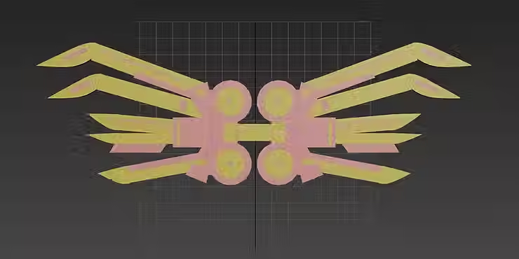


Of course, I did not want my model to remain pink and yellow; that would not fit the game's underwater theme.
At first I considered using Adobe Substance Painter, but I encountered several problems when exporting the pair of wings which led to parts of the model being moved and changed in scale. I searched the internet and asked the tutor present for help, but they could not manage to figure out what the issues were, so I ended up using the material editor on 3DS MAX instead.
Opening the material editor, I selected the entire model and decided on a turquoise aluminium base. Using the hue slider I chose a darker shade to match the depths of the ocean.
Next I picked out the two slanted cuboids either side of the propellers, making them a brushed metal in a more vibrant shade of turquoise to represent the variety of tones found underwater; it is not just all one shade, there are blues, greens, yellows and purples.
I used this same shade of turquoise for the wingtips, highlighting the sharpness and possible uses as a weapon. For the smaller details I chose polished aluminium in light blue that would mimic a glowing material against the darker wing base when rendered, resembling bioluminescent marine life.


The model needed lighting in order to be visible when rendered, so I selected 'arnold lighting' and brought the sphere over to the left, highlighting the top wing corner from above. I scaled the radius to be wider, wanting to spread the light further across the model rather than having a large number of lights that could become muddled up. I duplicated this one, bringing it over to the top right in a similar manner as the first.
After doing this several more times I had balls of light surrounding the wings on all sides, allowing photos to be taken from any angle instead of just the basic front view.
I checked over the model materials before rendering, selecting any that I believed were too bright and lowering the hue. The varying metal materials I had used created the exact mechanical appearance that I had been aiming for, catching the light and glinting sufficiently when I eventually pressed the render button. The difference in shades provided depth, the blue tones giving an ocean-like feel whilst the lighter blue seemingly glowed against the dark turquoise for a futuristic appearance. Overall, it worked just as I had hoped.
COMPLETED RENDERED MODEL - WITH MATERIALS


Submarine Designs

Gracie
I wanted the submarine to look unique as it's the thing the player will be spending the most time in aside from the ocean so I threw around the idea of the appearance being modelled after different underwater creatures. I ended up finishing about 5 different versions, including the default look of a basic fish with no noticeable benefit. I also debated have different version of each variant appearance wise but for time I stuck with one form for each. As for colour scheme, I decided to go for a white and a deep blue theme, it was simple, sleek and fit with the aesthetic of the game but I imagine it could be possible to colour the submarine whatever colour you want.
A main feature of all of them was its 'vacuum' mouth. Its mouth would open, sucking in the fish in the area easier in case you need a bunch for experimenting. This would only work with small fish at the beginning.
Another bonus to this upgrade feature was that each sub variant would have its own perks and different gameplay styles. For example; the jellyfish variant of the submarine had installed special stingers that could paralyse fish that got too close, which means more close fish can't escape as easily. I imagine at first it would only be for a few seconds but you can upgrade it to eventually stun them completely.
There were a few animals that I had sketched to be sub variants but either for time, not finding many unique features it could have or being unable to translate it into a design that matched the others, I couldn't include them.


SUBMARINE INTERIOR


Rhia
My final contribution for this the project was creating a few concepts for the interior of the submarine. When planning the interior of the submarine, I looked at a few of Gracie’s concepts since they created the exterior for the submarine and I applied that concepts I would create. I made a total of three concepts. The first room is a small research room with a big window that can be used to look at the outside to study ocean life. A storage tank and a tablet, two gadgets which Emmy has designed for the player to use. These are conveniently placed in the same room so that if the player spots and new creatures they can quicky equip them on. The next location on the submarine is the lab, which holds hibernation capsules and cryonics storage to preserve newfound creatures. On the side of the wall is a touch screen that the player can use to check their statistics, check the scientists’ roles and information about the new creatures. My final art piece is the main lounge room, this concept inspired by the jellyfish submarine design, the top floor having the beds for the scientists, the middle area which has the pilot control panel, some kitchen and science features with a descending staircase to another area of the submarine. I stuck closely to the blue colour pallet of the exterior submarine designs, making the inside and outside feel connected to one another using orange, a contrasting colour enhancing the visual appeal.
Marine creature designs
RHIA


Before starting the project, I created a few clay sculptures coupled with traditional hand drawn pieces, while these designs where more in the moment they provided me with an idea on what colours I favoured in making creatures. Since I had been previously focusing on bioluminescence creatures, I wanted for my creations to reflect this combined with this, one of the levels in Amalgamation would feature a bioluminescence area.
For these clay sculptures I came up with three creatures and one item. All three creatures follow a cool colour scheme. The first creatures form is cuter looking, with a stubby form and an eye that glows. The next creature besides it has taken inspiration from bioluminescent jelly fish, the other creature is created to look like a slime, taken inspiration from Slim Rancher creatures, since other members in the group have been looking up the design and mechanics of the game. The fourth is a form of currency the player can use in the first levels of Amalgamation with the mermaids.
CREATURE DESIGNS


Next, I have created a few rough sketches, some of entirely new creatures and others which are combinations of plants and other species. To this image I’ve created other species, the water creature Inspired by the water spirit in Hilda. Other creatures have taken inspiration from plants and insects.
TRIBUS OCULI


Tribus Oculi’s name was given to the species since it possesses three eyes. Having these features acts as an advantage which enables the creature to spot any predators that may approach it. The Tribus natural territory is within the bioluminescent biome. Tribus Oculis design reflects colour pallet of creatures found in the real word of underwater bioluminescent creatures, the body takes the design of the jelly fish, the bell umbrella-shape top, this is fused legs that are reminiscent to seabirds which have webbed feet that help the creature to swim around underwater and grip prey. On top of the Tribus Oculis head act as antenna that can feel the temperature changing in the Bioluminescent biome and to further detect movement, glowing orbs are seen on top of the antenna this act as a communication device which can be used to signal danger to other creatures and the player.
Referring to my visual mind map I discussed how there could be a function where the player could be able to create their own bioluminescent light defeating one of the glowing creatures, adding onto this the player can then obtain bioluminescent light by means of a more passive way, befriending the creature. Taking more passive route makes it so that the other creatures around you feel safer meaning your player can collect more information on other creatures. Conversely, if the player decided to take an aggressive approach by stealing or slaughtering the creature for their bioluminescence the creatures in that vicinity, if witnessed the scene will constantly avoid you, the player.
SUMIT


The next species that I have created is a fusion between a ladybug a jelly fish specifically the helmet jelly fish, characterises I have taken from this creature is the pigment inside of the jelly fish, but instead of the colour being red I’ve created two colours for Sumit name to glow, Purple and Green. The colours signal to the player and other life forms the current state Sumit is in. Glowing purple means that Sumit is ready to attack the player or sees the player as a threat. When Sumit turn’s green, which is its natural state, it implies that the creature is calm. These are one of the creatures that tun hostile if the player tries to take its bioluminescent light, instead of retreating it will fight back, if placeholder gets a successful attack, it will automatically take any random item the player has in their inventory.
VITAM VASRATOR


Vitam Vasrator is once of the creatures found in the Icy place. The design has been inspired by stalactites and stalagmites which are naturally formed found in caves. The sharp points on its head are formed to look like horns, this creature also had withered clothing made to look uncared for and withered away. As discussed previously, I talked about how the stalactites could be sentient slowly growing closer to when the player pays no attention to them. Vitam Vasrator is a species which is mutated with a clock, with this it can control time, with this power it can manipulate any stalactites or stalagmites that are within its range, to move closer to the player. These act as spikes being able to penetrate through the player.The colours I’ve used come from the cave pictures that I have taken, I’ve given this creature a more duller colour pallet compared to the other creatures that belong in the bioluminescent realm to give the creature more of a contrast to each other. Unlike the bioluminescent creatures you cannot befriend Vitam Vasrator, the deeper you go into the levels the less friendly each creature will be. Vitam Vasrators main aim is to stop the player from advancing deeper into the levels, if you're character runs into Vitam you will need to learn how to break the clock. This is especially hard since it can reverse time giving Vitam the power of second chance.. By trapping the mutation and getting a stalactite to pierce into the clock you get rid of its power to manipulate time.


Emmy:
I have volunteered to create boss concepts that represented the amalgamation. Initially I traditionally started sketching out up to 6 potential designs, and I tried pushing the shapes, forms and expressions of the character designs, trying to make them look weird and disgusting. I showed some of these designs to the other designers in the team, and Red really liked the concept of idea 4, to which she developed the character further and tried to incorporate the character into an environment.
For the surface creatures, I tried to make them look really soft and friendly, so I used circular shape language and softer line art. These designs were influenced by Red's, and Gracie's visual research from Slime Rancher and Pokemon research, where the character designs were simple, yet have colorful and fun pallets and shape language.
I also did a mermaid concept design, which was inspired by Rhia's initial research on bioluminescents. Initially I thought she could be a guardian type of character, potentially trying to protect the researchers from discovering the monster that lurks below. I incorporated some patterns on her body and a dark blue colour pallet to make her blend into the environment, to evoke the character's mystery and her association with the Hadal zone.


Gracie
Before the design tasks were discussed, I had already sketched out a few random ideas for creatures that fell on the more cute side. Most of them were based on elements like ice, taking inspiration from Pokémon's designs. Ultimately, I had to choose 3-4 designs for the upper surface levels and the same amount for the lower bioluminescent and ice levels. For the above creatures, I wanted them to look more cutesy and nonthreatening, I focused on using more brighter colours for them and stuck with 4 colours for each to not clash as much.

Scurraish - Found in levels closer to the surface
I couldn't call it a clownfish as there was an actual species of fish nicknamed that and I feel this design combines elements of a jester as well with its fins looking similar to a jester hat as well as its checkered pattern.
Histeria - Common varient found near the surface
This is probably the design where I leaned into the Pokémon inspiration the most. This creature is slightly similar to Toxapex design wise where hey hide themselves in a shell however this creature is not toxic or willing to harm. As the name is a play on wisteria and hysteria, this creature is a very sad and not confident so it hides itself, only its tentacles poking out. The design is also reminiscent of a tree, I wanted to design a creature that was slightly based on plants as I thought it would add to the oddity of the area.
Selati-verm - Can be found anywhere where materials spawn but mainly resides deeper
For the lower levels, I did have a bit of trouble pinning down the exact look of the creatures. While I did want some of them to be more creepy, I wanted them to look even more unique as well as lean onto more gimmicks each of them could have. One of the creatures I made I decided to base on the material for the game I designed earlier, that would hide in the ore vein and eventually fuse with the material. It could also blend in with its environment with its camouflage ability.
Gelatina Carnivora - Found in the deeper levels
The main inspiration for this creature was the Venus fly trap, and how to translate that into a creature. I combined it with a jellyfish as I though that shape with the tentacles would fit it the best and instead of the usual head, it can open right in the middle and trap its prey instantly like a sea angel. Given the size, it could also be a danger to the player. The colours are that of the actual fly trap as I thought the complimentary colours of green and pink fit well.
Nitidus natator - Found in darker levels
Another creature I designed that's similar to a jellyfish and combines a plant, though it's not based on a particular flower. The colour palette is quite analogous with red to pink to purple.
Anguilla lingua - Found hiding in bioluminescent areas
The fish attached to the tongue is slightly inspired by the real life parasite that affects fish by eating and replacing its tongue. The idea was that the mini fish would act like a decoy luring the prey to their death. The actual fish is blind so the tongue fish also acts as it's eyes as it guides it through the dark parts of the ocean.


Els - Creatures
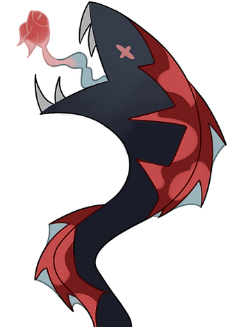
NARWHAL GIRL


The first idea I decided to bring to life was a part human, part narwhal creature.
I began by shaping several spheres to create the head, a cylinder for the neck and cuboids for the flowing strands of hair. Next, I carved out the facial features using the 'crease' tool, creating a button nose and big, cartoonish eyes with prominent lashes. For a more whimsical appearance I stretched the ears, making them pointed, similar to those of a fairy or elven race.
I wanted to keep some animalistic features to make it obvious that the model is based off a sea creature, so I chose the distinct narwhal horn, the thick whale tail and a pair of small fins. I sculpted and placed each of these elements in their appropriate places; the horn atop the head, the tail protruding from the back and the little fins attached near the base of the tail.
After sculpting from the waist up, I added some legs; I did not want the feet to look human, preferring a more animalistic claw-like idea to normal toes. I chose to create bulky feet that matched the spiral pattern of the horn, sticking five sharp claws in each foot to remind people of the dangerous features some sea creatures possess, regardless of whether they use them for violence or not.
I struggled to create the hands, using several boxes and remeshing them together to produce a smoother appearance then flattening the palms and sharp edges for soft, slender human fingers.
Since the connection between the hands and wrists was not looking good, I gave the character a few bracelets on each arm; this also gave her some personality.


EMMY'S BIOLUMINESCENT MERMAID
(3D MODEL by Els, original CONCEPT ART by Emmy)


The next creature I decided to model was based on my classmate's concept art; I wanted to create a different perspective on their ' bioluminescent mermaid' by presenting it in 3D form.
I began by stretching and flattening parts of a sphere, making the basic head shape and then smoothing any sharp edges for a soft jaw, matching the concept art. I proceeded to subdivide the polygons for a more detailed approach, sculpting the facial features until the mouth and nose were to my liking. The ears were next; by duplicating a smaller, flattened sphere and using the mirror option, I pinched various parts to form spikes until the shapes resembled two siren-like fins. The mirroring was useful, enabling me to move the two ears to the correct place either side of the head rather than having to create two separate ears.
I placed a thin cylinder under the head then re-meshed the shapes so they were fastened together, allowing a smooth connection between the head and neck. I did the same thing with the torso, arms and hands.
For the tail, I stretched and shrunk parts of a cylinder, connecting the bottom edge to two spheres that I sculpted into large, spiked fins which matched the ears. I added two more fins either side of the hips, as pictured in the concept art; however, I decided to alter the shape of them to better match the ears and tail.
The hair was somewhat difficult, since I was still learning the different techniques used to create decent-looking hair for characters. I chose to sculpt spheres and moved various parts, bending each until I had a smooth curve that resembled thick strands flowing in the water.
Lastly, I had to sculpt the bandages covering the eyes and upper torso. I struggled with this due to the mirroring options; I could not seem to take the setting off the cylinders I was using to circle the torso and head, making each movement to the shape alter another side of that shape so it would not fit properly. Eventually, I decided on covering up the peculiar mirrored parts with the other bandages, manipulating them in a way where they worked together yet covered the blips that each bandage was unable to avoid.


WHALE LOUSE GIRL


For the third creature I wanted to create something slightly unsettling, focusing more on the animalistic aspects of the model rather than the humanised parts.
I began by creating a basic body shape from a stretched sphere; I cinched the waist and then produced eight cylinders in total for the human arms and legs. I loosely shaped a sphere and placed it atop a cylinder for the head and neck, sculpting two more spheres with the mirror tool to form a pair of elf-like ears and some delicate antenna. I selected and re-meshed the shapes together, creating a smooth connection between each so the body had a more natural appearance rather than leaving it with obvious edges.
I continued with the body shapes, wanting to finish with the overall shapes before adding smaller details. Adding cylinders, I intended to make the claws seen on the whale louse and attach them to the human body alongside the normal arms and legs. Thinner cylinders were placed atop the big cylinder, leading to the smooth curve of a sharp claw. I duplicated these shapes and used the mirror tool to make sure there were four claws on either side of the body in the correct position, mimicking the look of a whale louse from underneath its stomach. The re-mesh was not needed for the claws; I wanted to keep the obvious lines to match the crisp, shell structure of the louse legs in the pictures above.
Once the basic shapes were done, I focused on the face details.
Zooming in and subdividing the polygons, I sculpted an arched nose, full lips and big, bug-like eyes with three prominent lashes each. By using the crease tool I could outline any defining points, such as the eyelids, nostrils and opening area of the mouth. The hair came next, a difficult part for me; I formed and stretched several spheres, using the movement tool to create soft curves that resembled thick strands of hair. I moved each strand so it was in the desired place on the scalp, aiming for a soft, wavy look that contrasted with the sharp claws of the creature. I wanted the overall look to be appealing yet unsettling, almost alien-like, so this contrast represented being drawn in to the human beauty but also being cautious of the unknown animalistic aspects of the creature.
Lastly, I added three stretched spheres, subdividing the polygons and moving various parts to form stiff curves and waves that looked similar to seaweed. By using the smoothing tool I made the curves softer to appear as if the seaweed was flowing in the water current, wrapping around the creature's torso and right leg.


Red
Tasked to design the fish mainly found in the Shallow Reef, I kept in mind that these fish would need to look more appealing and cute to the player as the designs would need to become more horrifying the deeper you would go. I started off with a few sketches of normal looking fish; they would be collected in game and used to make new amalgamated fish and therefore kept them at a more realistic standard. I used fish species like Salmon, Guppies, Common carp, Gar, Goldfish, Basa Fish and Koi fish to create these designs and later on used Anchovies and Sea Bunnies to create more unique naturally amalgamated designs.
After sketching out a page I asked what fish design my peers were drawn to the most, the sad fish seemed to gain the most attention due to its pitiful expression, so I decided to finalise the design. I based the colours off of porcelain and koi fish, giving it a glossy sheen as if it were glass; I decided on this texture inspired by Slime Rancher and how the slimes look glossy, as well as wanting this fish to look delicate and fragile. Overall I chose these fish to be inspired off of the 2000s design style Frutiger Aero for its clean, vibrant and dream-like look, taking aspects like the shiny bubble features seen in photos of the aesthetic. I gave the sad fish two variants; one following a more traditional koi fish colour palette and the second following the typical porcelain blue combined with the blush seen in porcelain dolls.
I wanted to adapt and finalise more fish designs and chose to use the goldfish inspired sketch. I do keep the final designs close to the original as the round shape design and big eyes fit the appeal and cute aesthetics of the Shallow Reef. I did change the design for the baby fish, I wanted them to be more similar to the bigger fish to stop confusion with small species like the guppy. All I did was exaggerate some features on the fish and make the colours a little desaturated like how some species of animals gain more patterns as they grow older. The different colour variants are based on the Shallow Reef concept art, using the colourful patterns as camouflage.
My final fish designs lean more into amalgamated territory, as I wanted to finalise at least one natural amalgam design. I thought of this anchovy inspired species that amalgamated to disguise itself as jellyfish to avoid predators that would hunt them. My thought process was taking a bunch of these small fish and fitting them together to make a silhouette of different species of jellyfish. Using the sketch I made 3 different variants, the eyes are all in a line where the muscle ring would be on a jellyfish; this is inspired by box jellyfish having small eyes in a line around this area. I tried to think of different ways the fish could morph themselves into the silhouettes of different jellyfish species making sure the arrangement of them varied, as well as the colour palettes being adapted from the anchovy colour palette to more colourful pinks and blues.


Keira
For my designs, I took the chance to focus more on the silhouettes that I would be looking at, using references of underwater creatures among a few other things for inspiration.
The images I put on here are a few sketched out designs that are both better and worse of the entire bunch that I gave myself the option of developing more into digital designs (the jellyfish and the leafy sea dragon).


In the end, I didn't end up completely finishing off the detailing for the jellyfish mermaid, I just couldn't figure out how I wanted to detail her. Looking at her now I wish that I had kept her human skeleton showing through her.
The leafy sea dragon mermaid is completely developed. I drew her with lighter line art in the hopes of having that ethereal underwater glow, but I'm not really sure whether it actually worked. The opacity on the darker green is slightly lower with details in the same colour at full opacity drawn on the top.
Submarnie Upgrade Material Design

Gracie
For the submarine upgrades, there needed to be a main material that needed to be designed to be used. When brainstorming, my original idea was to make it this square node that was pink fading into purple with a swirl pattern all over it. However, the more I thought about it the more I was unsure about this vision. Moreover, I wasn't sure it would fit in well with the environments, as I wanted it to fit in with any area of the game.
Ultimately, I decided to go for a more unique shape, deciding to make the silhouette more like stony coral so it would look more in place, the inside of the ore itself was based on the square shapes of bismuth. I also changed the colours to more light mint green to cyan as the colours looked more appealing to me. as well as included white swirls all around to make the ore look less bare.
Team Logo + Company Logo
Red
Despite the name of the company being undecided, I needed to work on some kind of logo for it. Thinking it would be interesting to foreshadow the big monster at the end of the game, I tried to design the companies mascot reflecting the designs I and the team made; I based the mascot off of a GFP axolotl, as I thought it would fit the theme of sea creature experimentation.
I also made the team logo which was fairly simple; I used water ripples to represent the two O’s in Ocean Oddities with a small fish within the overlap.

